Design projects • • • Experimental Typography
Experimental Typography
Projects exploring and experimenting with typography.
3 Things I Have Learned
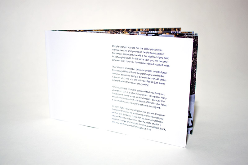
Inspired by Stefan Sagmeister’s experimental typography and his publication “Things I have learned in my life so far,” these pieces of unconventional typography feature three things I have learned in my life so far.
- Slow down and live
- Lose yourself to find yourself
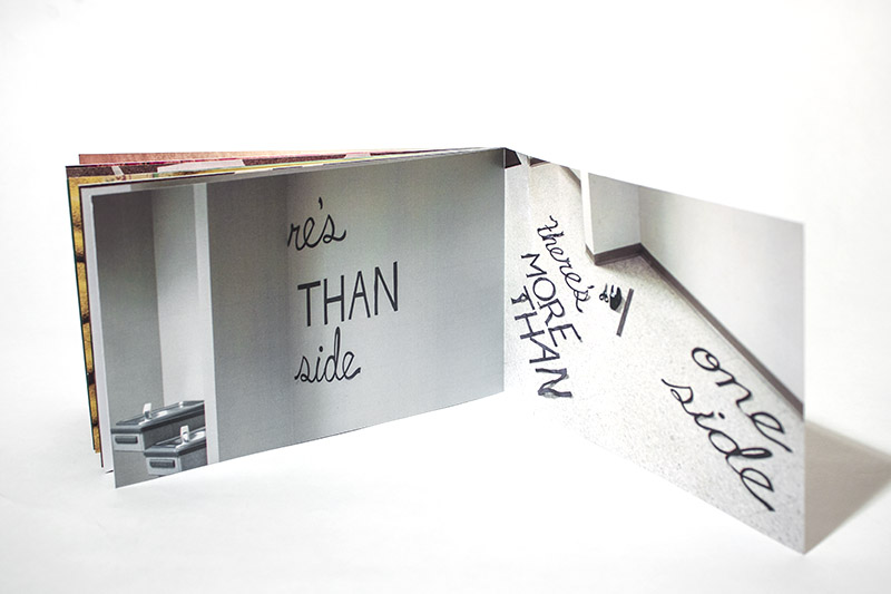
- There's more than one side
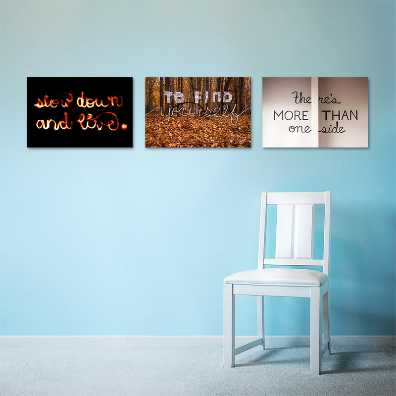
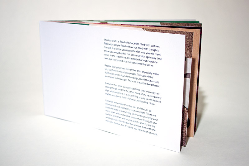
The project comprises of three main images and three supplementary booklets that show insight into the process and meaning of each life lesson
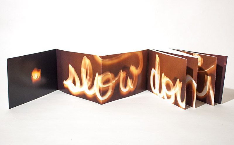
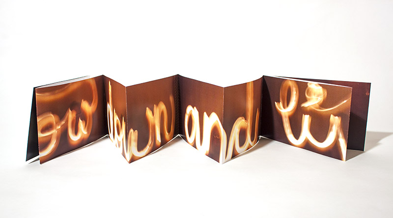
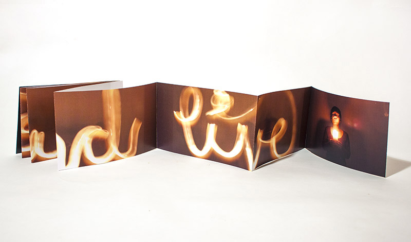
Lesson 1: Slow down and live
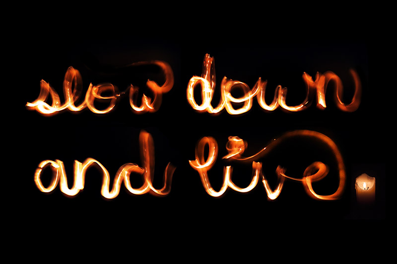
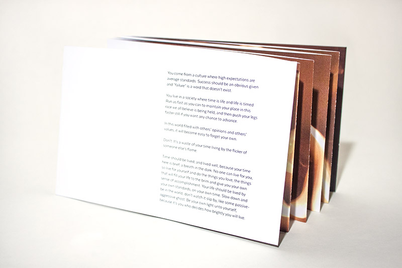
The booklet reveals how the quote was made and shows it stretched across in accordion format, forcing the reader to slow down and step back
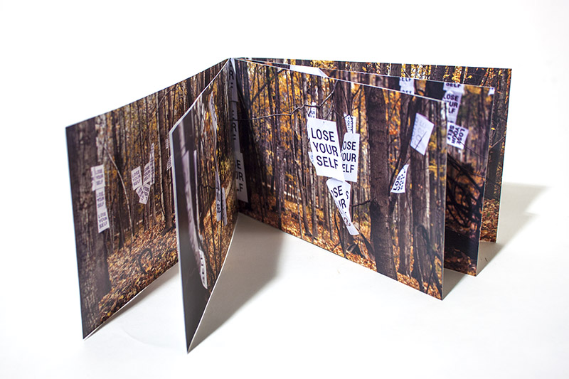
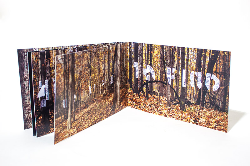
Lesson 2: Lose yourself to find yourself
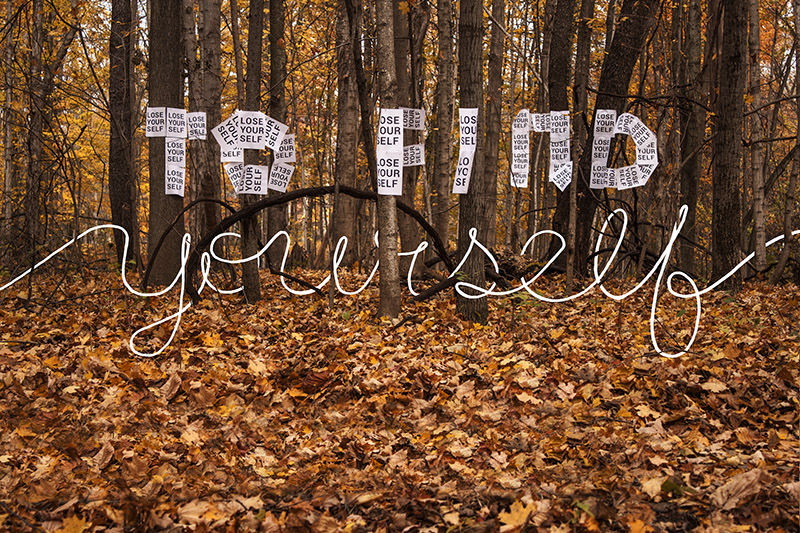
The booklet shows in-progress shots of how the quote was set up and how one can only find “to find” from a specific point of view
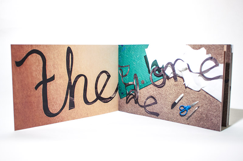
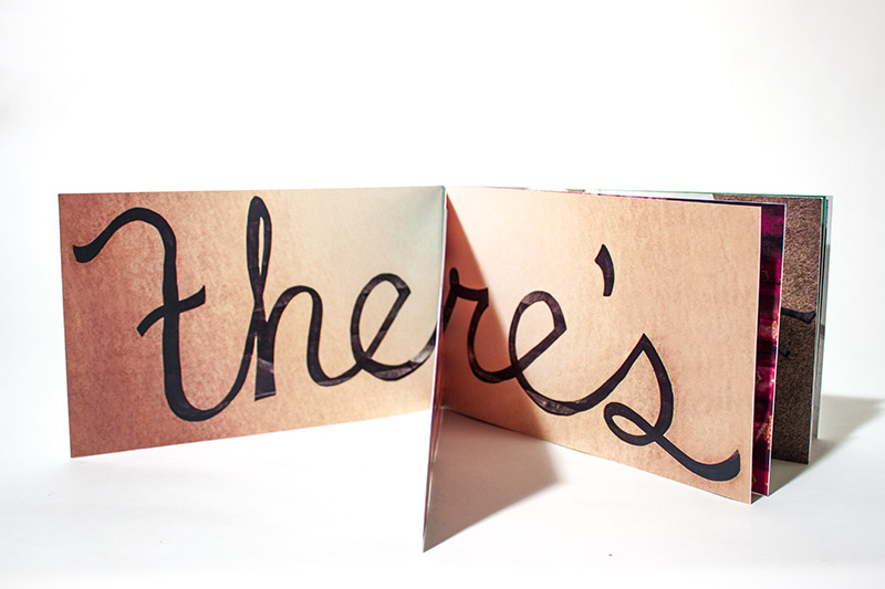
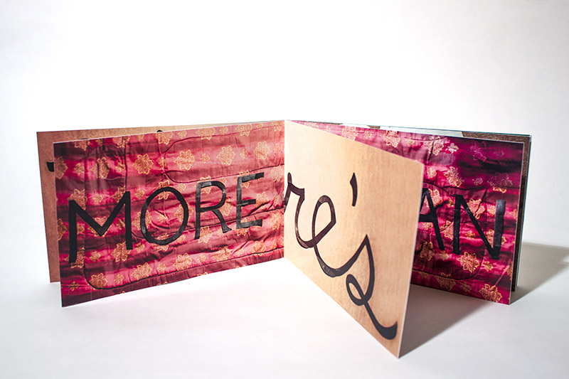
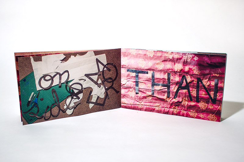
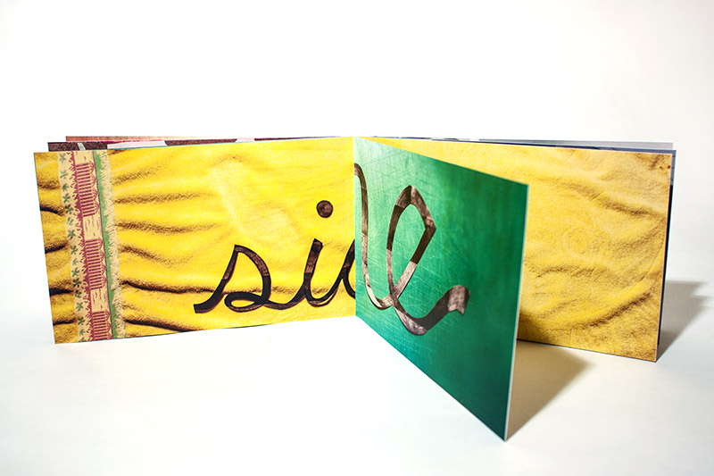
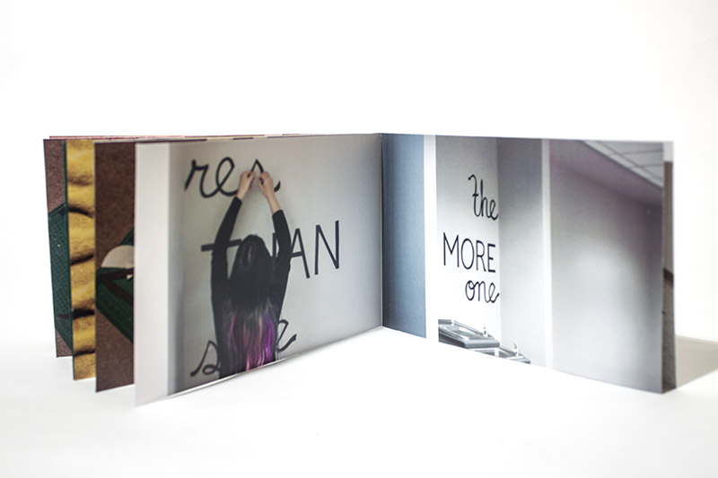
Lesson 3: There’s more than one side
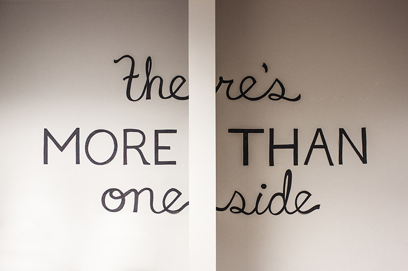
The booklet shows in-progress shots, how a partition wall aids the meaning and experience of the quote, and uses pages to mimic dividers, exemplifying how more than one side is needed to see and understand the whole story
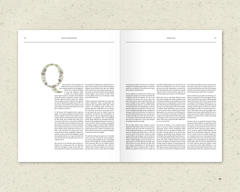
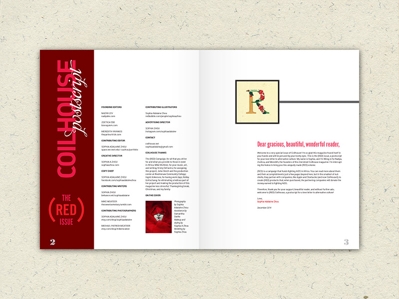
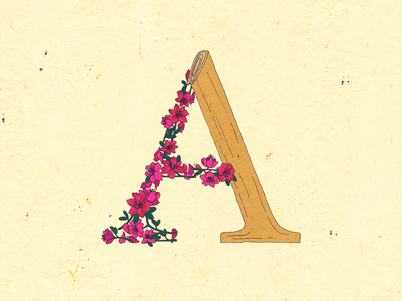
Le Jardin de Adalaine
A display typeface inspired by scientific plant illustrations. Each letter-form integrates different plants whose common name begins with the respective letter. The forms are based on the existing typeface Georgia for its larger features, allowing for the intricacy of ornate floral elements.
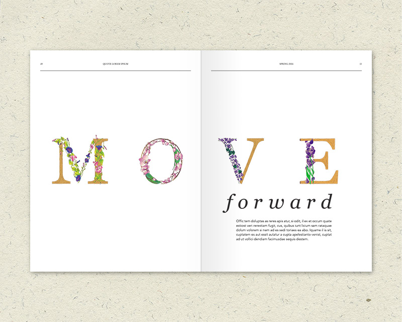
This display typeface can be used for many things, such as postcards, headlines, or article drop caps